
DARK STAR ESPRESSO
Dark Star Espresso
Brand Strategy
Creative Direction
Visual Design
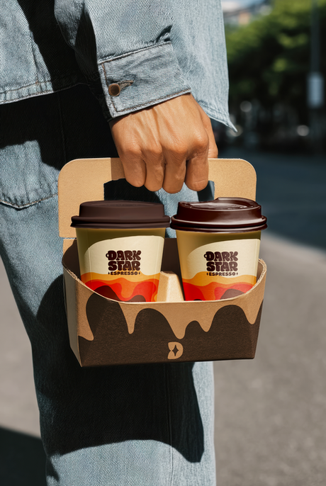
Packaging
Custom Art
Dark Star Espresso - is a sister brand to The Tufted Puffin (my previous case study). In it's initial baby stage - the cafe brand had an Identity crisis. Should it be Tufted Cafe? Should it follow the same branding as Tufted? and many more questions.
The fruitful 1.5 year expansion and growth of Tufted Puffin resulted in me being the brand strategist for this cafe brand from zero. With the birth of Dark Star Espresso - I was tasked with the end-to-end creative direction and strategy.
I’ve crafted a 'fresh yet cozy-retro' brand experience. 2 drive-thrus are operational and the first cafe location's, grand opening is happening soon in March 2026!

Dark Star Espresso
BRAND DEVELOPMENT
After initial discovery sessions and competitive analysis - we came up with the personality of the brand to anchor our decisions.
Inspiration arrived from retro groovy/soul music. The vision was to create a coffee brand & physical establishments that are cozy, retro yet fresh with a softer aesthetic.
Brand Personality

Branding Strategy Map
Audience
The "Everyman"
Personality
Coffee & treats
Groovy

Fun, Casual
Down-to-earth
Approachable

Cozy retreat
Community
Playful nostalgia

Locals & travellers seeking culture, community and comfy 3rd spaces

Variety of beverages & confectionaries
Moodboards

We liked cozy colors
And curves for the cozy feeling
Approachable aesthetics
Brand Identity
VISUAL LANGUAGE
With the business groundwork done and strategy planned, it was time to develop the brand assets for Dark Star Espresso!
With a time crunch, I had to move quickly to strategize and design the visual identity.
Quick options to decide direction

Liked the basic direction of option 1 - Curvy, welcoming.
Needs refinements next
Time crunch!
REAL WORLD CONSTRAINTS
Usually I would not rush into refining the logo before getting the colors & mockups done and approved.
But often there are unforeseen constraints and this is where our 1.5 year partnership of building Tufted Puffin came into play.
Respecting the constraints, I was able to map out colors, patterns, aesthetics and illustrations in an unpolished manner to discuss with the client - who understood the vision and we proceeded.
Logo Mark


Word Mark
Combination


Color Palette
COZY & RETRO FRESH

Illustrations
HUMAN TOUCH
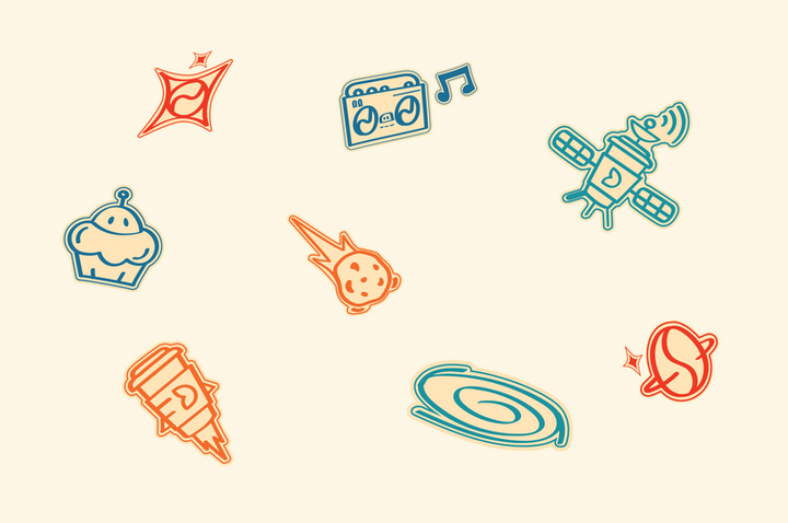
Hand-drawn, fun illustrations to marry the Space theme with the retro colors.
Birth of Dark Star
PUTTING 'EM ALL TOGETHER
It all makes sense when it comes together to reflect the Brand's essence & soul.


More to come!
UNDER DEVELOPMENT
The main cafe is being painted with the Brand Colors right now!
Full Brand Guidelines, Website, Packaging, Photos of the painted cafe & a lot more exciting stuff in the works right now! - updates soon!